

Welcome!
This quarter's Four In Art theme is...
Stained Glass Shadows.
I decided to illustrate with gray, black and white glass
encircled by red "lead".
I know stained glass shadows are usually full of color,
but this time around I thought I'd use a range of grays from white to black.

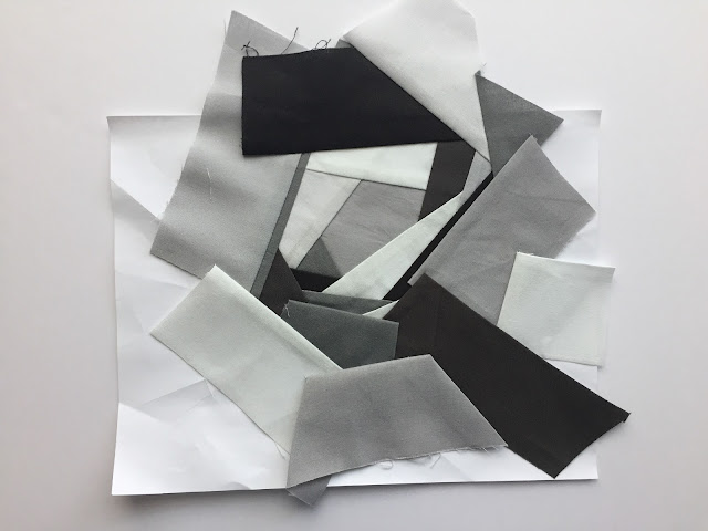
With each new Four In Art quilt I like to try a new technique.
This time around I tried improvisational paper piecing.
Here's the first step.

And here's a crummy photo taken at night of what it looks like after
spending a half hour or so improvising on this little guy.

Ahhh...finally some better light in the morning to
show off how this first step went.
And here's the backside.
I added washi tape over lines that I had to tear while I was still sewing.

Next step I used a compass to cut out a shadow of a round
"stained glass window."
My 12 year old asked what the compass was?!?!?!
I have to blame lack of parental example or lame California math curriculum on this one.
(You can't teach how to use a compass when EVERYTHING at school is taught via computer. Using a compass is a hands on activity folks!)
So..... today my daughter learned how to use a compass.

Next I made some 1/4 inch bias tape, but it ended up to be 1/2 inch tape.
Then I pinned the heck out of it.
After making a wedding dress last year for one of my older daughters
I fell in love with these glass headed pins.
They are super fine, slightly flexible, and amazingly sharp!

Here's my quilt sandwich.

I decided to quilt this mini with mono filament thread.
The rest of the photos are taken at night so the
lighting goes down hill from here on out.


For the binding I used the backing fabric.
I cut the backing fabric a 1/2 inch from the quilt top
then I ironed and rolled the fabric to the front,
then pinned and pinned and pinned.

Ta da! Here's the final Four In Art Project.

You can view other Four In Art projects by clicking the links below.
| Betty Ayers | https://www.flickr.com/photos/toot2 |
| Catherine Chisholm | http://www.knottedcotton.com |
| Elizabeth Eastmond | http://www.opquilt.com |
| Janine Green | http://www.rainbowhare.com |
| Nancy Myers | http://www.patchworkbreeze.blogspot.com |
| Rachel Riley | http://www.rachel-thelifeofriley.blogspot.com |
Love this one, Simone! I love that it makes a "b" for beautifully done and executed, while turning the idea of stained glass shadow on its head with the more traditional hues of a shadow: a range of greys to darks. Fun to read about the process. (You didn't say why you use paper piecing--was that to stabilize the construction?) Another technique to add to my arsenal. Terrific quilt--yahoo!
ReplyDeleteTo answer your question about why I used paper piecing... I've been trying to explore other ways to use paper piecing and I was wondering what would happen with improv paper piecing. Sometimes crossing two techniques results in a surprise.
DeleteI enjoyed your conceptual reversal of the theme into gray shadows. The red "lead" is fun too. And I like the use of asymmetry and negative space.
ReplyDeleteThis is great, Simone. That paper piecing looks amazing and I really like the red circle around it. Great border choice too.
ReplyDeleteI love this - beautiful. Your quilts always take such interesting directions, and like all of them this is really striking!
ReplyDeleteWay to think outside the box! I thought it looked just like a black and white rose when i first saw it. My kids have to learn to use compasses in 7th grade. Yay that you got to teach it practically!
ReplyDeleteSimone, I always know your work is going to be unique and you never fail! This thing is just wonderful in all aspects. And so proud that you gave a math lesson (which will undoubtedly come in handy for the 12 yr. old somewhere down the road!) in the midst of quilting. Perfect colors and composition!
ReplyDeleteThis is fantastic interpretation of the theme. Really eye catching. I love the way you've used a a limited colour palette and created a minimalist modern effect and I enjoyed your step by step descriptions :)
ReplyDeleteReally cool!
ReplyDelete